A Quick Introduction to Color Contrast and Accessibility
What is color contrast ratio?
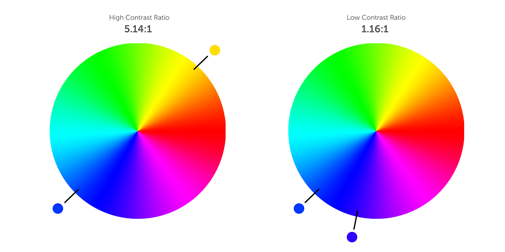
Color contrast ratio is the measured difference in perceived brightness between two colors.
If you compare colors on opposite ends of the color wheel, you’ll see a much higher contrast ratio than colors that are on the same side of the color wheel.

Why is color contrast ratio important for accessibility?
Using appropriate levels of color contrast is necessary in order for our products to be accessible to everyone, including users with visual disabilities.
While color contrast is very important for people with visual disabilities, there are also a number of other factors that impact people with perfect vision:
- Screens have different sizes, resolutions, brightness levels, and innate contrast
- As people age, the amount of light that can be perceived naturally decreases
- The brightness of a person’s environment has an impact on the contrast they experience on the device they are using
Here are some common examples of color contrast ratios.

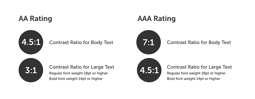
WCAG 2.0 AA and AAA standards
The World Wide Web Consortium (WC3) created Web Content Accessibility Guidelines to help professionals create products that are accessible to everyone, including people with visual disabilities.

Most products only need to achieve the AA rating in order to comply with WCAG. The AAA rating is important for products that are oriented specifically toward people with visual disabilities.
How to measure if your colors are accessible
The simplest way to find out if your colors are accessible is to use Contrast Ratio created by Lea Verou. Simply plug in foreground and background colors and the tool will tell you what the color ratio is. You can also use browser extensions like the Color Contrast Analyzer to measure the color contrast of an entire webpage.
Colorblind and a11y are fantastic Figma plugins that can help automate the process of checking for color contrast accessibility.
Some things to consider while testing your color contrast ratios:
- Don’t forget to account for hover states, active states, and any other modifications your elements might undergo
- Icons and input borders (radio, checkbox, etc.) must also have a 3:1 color contrast ratio (4.5:1 for AAA rating)
